The Best Artist Website Layout to Sell Art Online
Your website is often the first place collectors encounter your work. Before they read about you or enquire about a commission, they experience your layout. A strong artist website layout does more than display artwork, it guides visitors, builds trust, and gently leads them towards connection and purchase.
In this guide, we’ll explore how artists can structure their websites to feel professional, calm, and intentional, while making it easier for collectors to engage with original art online.
Why Artist Website Layout Matters More Than You Think
Website visitors form opinions quickly. Within seconds, they decide whether to explore further or leave. A clear and thoughtful artist website layout encourages visitors to stay longer, explore collections, and emotionally connect with the work.
Cluttered pages, confusing menus, or inconsistent visuals can distract from the artwork itself. On the other hand, calm layouts allow the work to speak for itself.
The Tate emphasises the importance of clear visual presentation when showcasing art digitally.
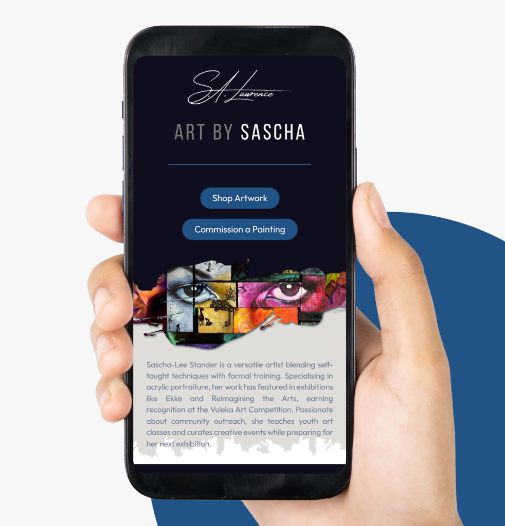
Core Pages Every Artist Website Should Include
A successful artist website feels intuitive. Visitors should understand where to go without thinking.
Most artist websites benefit from including:
- A Homepage with featured artwork
- A Gallery or Shop Page showcasing available work
- An About Page telling your story
- A Commissions or Contact Page
Each page should have a clear purpose and flow naturally into the next.
>> You can see an example of structured presentation in my online portfolio here
The Best Artist Website Layout for Selling Art Online
When designing your artist website layout, simplicity is key.
Place artwork prominently near the top of each page. Large, high‑quality images invite engagement and confidence. Avoid excessive text around artwork, white space helps viewers focus on the art itself.
Clear call‑to‑action buttons such as “View Artwork” or “Learn About Commissions” guide visitors without pressure.
For guidance on user‑friendly website structure, Smashing Magazine offers useful insights into visual hierarchy and layout principles
How Website Layout Builds Trust With Collectors
Trust is essential when selling art online. Buyers cannot physically see or touch artwork, so your website must communicate credibility.
A professional layout supported by:
- Consistent branding
- Clear pricing
- Honest descriptions
helps collectors feel comfortable investing.
>> Guidance on choosing and buying original art digitally is also covered by the Victoria and Albert Museum
>> You may also want to direct visitors to your original art collections from within blog content
Artist Website Layout Mistakes to Avoid
Even strong artwork can suffer from poor presentation.
Common mistakes include:
- Overcrowding pages with too many images
- Using distracting fonts or colours
- Hiding pricing or artwork details
- Overloading menus with unnecessary pages
Minimal, gallery‑like layouts allow artwork to remain the focal point.
Designing Your Website as an Extension of Your Art
Your website should feel like walking into your creative world. Texture, colour, and mood should reflect your artistic style without overpowering it.
Many collectors enjoy learning about process and intention. Linking from your website to thoughtful blog content adds depth and confidence.
>> For example, you may link visitors to insights on how to price your art confidently
Final Thoughts on Artist Website Layout
At its core, the best artist website layout feels intentional, calm, and honest. It supports connection, highlights artwork, and removes unnecessary barriers between the artist and the collector.
By structuring your website clearly, you allow your work to speak, and be discovered , more easily.